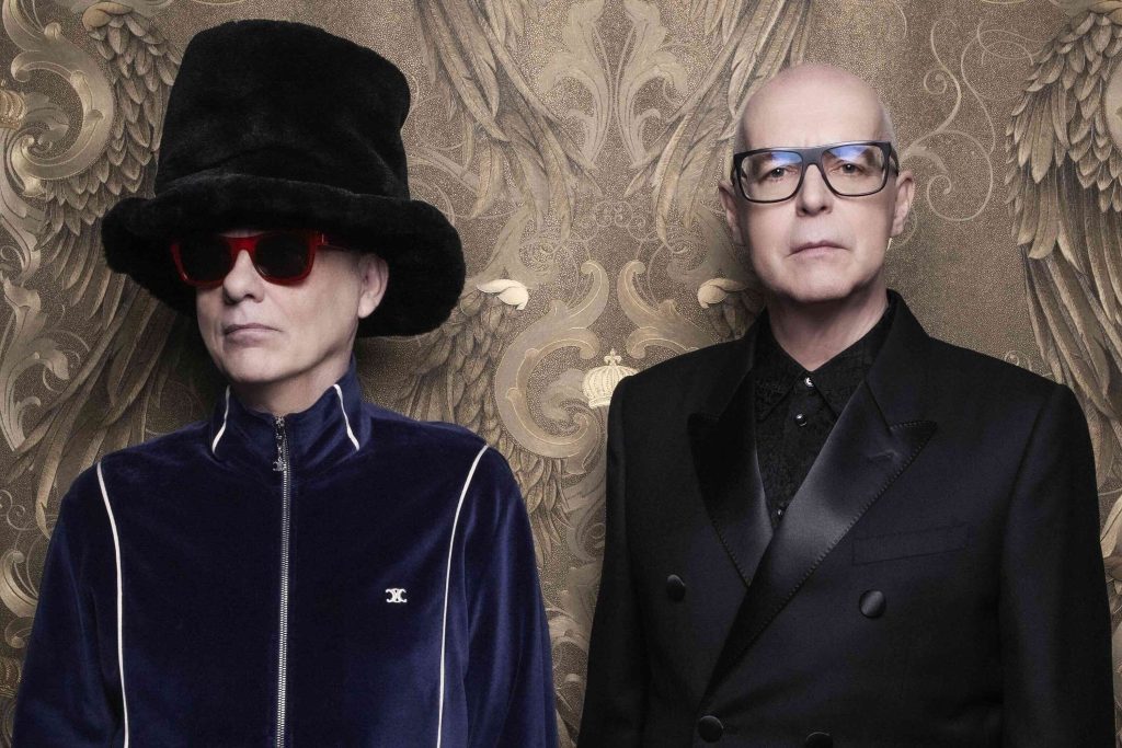
They went away and now they’re back – after a fashion. Irish band Horslips are once again in the news with a new biography (Tall Tales, by Mark Cunningham; published by O’Brien Press). Enough has been written, quite likely, about the band itself and their highly influential fusion of rock and traditional Irish music, but possibly not about their 1970s’ album artwork. All of the band’s album sleeves were conceived and designed by original member and graphic designer Charles O’Connor (extreme left in the above picture) and all of which were so different from the norm in that decade that if it wasn’t for the band’s full artistic control over their work they’d surely never have seen the light of day. Take it away, Charles!
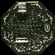 Happy To Meet – Sorry To Part (1972)
“At the time it had to be a showcase piece, and due to the fact that three of the band were in advertising anyway and everything was advertising related, and as we were working while we were performing and writing the music, it was an advertising showcase album. We wanted it to sell to record companies and that was one of the briefs – that we show off a bit – and we certainly did. It was over the top, and it cost us. The cover at the time mystified a lot of people, as did the music. The cover had to reflect and showcase the music, and I think it does to this day. The cover was difficult, but I came up with using the shape of a concertina because it was fun and eye-catching more than anything else. We did think collectively quite a lot about concepts and how we saw ourselves. We did know exactly where we wanted to go. It wasn’t that I was pushing the design in one particular direction. If I did something that the band hadn’t seen before and they liked it then that was fine. In most cases that happened. Getting the end result from the initial concept was seriously difficult. That cover, believe it or not, is not an existing concertina. We had to make one to fit the shape so the album sleeve would fit into it. It was really expensive and quite elaborate. But we saw it, looked at the rough layouts and said, why not go for it. We paid for it ourselves initially. I don’t think the album sold on the strength of the cover, but it certainly didn’t do any harm. From a tactile point of view, it was a nice sleeve to handle, too. Which you don’t have with CDs. We were all very happy with it – we thought it was wonderful.”
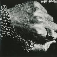 The Tain (1973)
“That was the serious start of how to integrate what we saw as graphically representing the band stage-wise and in print. The fist on the sleeve was my idea; a military concept in many ways. Often, when you put a theme together in terms of visuals and music, a lot of it might not be produced on stage easily, but because we were good at putting light acoustic music together with rock it worked as a show and as an album. The concept was very strong, the visual equally so. It’s a very strong and simple image, and the fans loved it. So did we. The band looked quite moody and mean and fairly straightforward on the album sleeves. But the image of the fist took a long time to photograph, despite its quite basic nature. It was a bit daft having your hand painted silver. My hand, too! The ring on the hand was a lovely ring – from an ex-girlfriend – but it was stolen from a dressing room somewhere in Ireland. The chain mail obviously wouldn’t have been around in Celtic times, but we wanted to bring it up to date, so we used basic military chain mail. It looks strong, doesn’t it? We used a pile of those fist images around the stage when we played live – huge backdrops of them in a boxing stadium stuck in the middle of nowhere with fists all over the place. The fist also featured on the front of our black Luton wagon – it looked quite demonic as we rolled into town, parked outside a Ballroom of Romance. It must have been a powerful image for young people who possibly hadn’t seen or heard much rock music in the early 70s. To see a van with a big fist on it must have been great!”
 Drive The Cold Winter Away (1975)
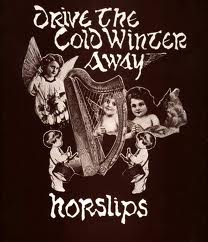
“An angelic, iconic figure on the sleeve – that was Horslips having fun again. The picture on the back gives you some idea of that. The album had a winter theme, a Christmas feel to it; it was recorded in four days and arranged in no time. A proper Horslips album? A busman’s holiday, if you like. The cover reflects that. There was a humorous aspect to the band – we didn’t take ourselves seriously, and we liked doing what we did. When I presented the montage of us as four women and a piper, with a little glass of stout beside Johnny Fean who had a Laurel & Hardy face on him, the lads just said, you can’t do that! We used Victorian postcards for images. Eamon Carr and I were serious postcard collectors at the time and they were humorous: the angel with her finger pointing up to heaven. It’s an odd little picture. There was a mock Irishness connected to it, because at the time people were scared of Bing Crosby singing Danny Boy and I’ll Take You Home Again Kathleen. We loved all of that – Two Shilleleagh O’Sullivan, written, probably, by a Jewish man who has probably never seen Ireland. The fun of all that inspired the montage in many ways. Old sheet music with the shamrocks around the edges. That album did very well, and we didn’t expect it to. We had fun with the music and the cover. I’d have liked to have done a harp cut-out, but that would have been expensive, wouldn’t it? That said, we didn’t care about the money. We enjoyed the idea that we could come up with something zany or quite simple. We had no inhibitions on that matter.”
 The Book Of Invasions – a Celtic Symphony (1976)
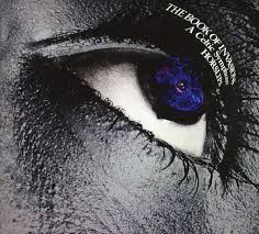
“It looks like a piece of Celtic jewelry, doesn’t it? That was actually quite a large screen print, printed on glass. We’d screen-printed this Celtic motif, which was a fairly basic traditional one. We had good fun with this one, because it was nice image. It’s pre-Christian stuff, the Irish Gods looking up to space. What I wanted to do was to try to combine the mythological aspects of The Tain with a star-gazing science fiction thing. The cover itself with the silver eye on it looks more like sci-fi than anything else. The shots of the band on the back of the sleeve sees them looking positively alien and swirling. Jimmy Lockhart looks positively evil – except he wasn’t, he was such a nice boy! What I did with the CD design was to feature as many of the graphics as I possibly could: the Celtic swirling thing, which was basically photographed through gelatin and was animated. There was very little film making at the time, but I had hoped we’d do something animated, but we never got around to it. It was an image, also, perfect for stage. That Celtic swirl became a 30ft backdrop with a hole in the centre for light to shine through into the audience when we came on stage. The whole auditorium would light up and it was magic. No one could see us, because we’d just be enormous shadows shrouding over the crowd. We were once again trying to integrate what we knew about Irish mythology into the music. The band knew a lot about the stories and felt a lot about them. Everything – visuals, music, from Sean O’Riada, the orchestrated thing – was integrated. We wouldn’t go home and listen only to Little Feat; it was far more Irish than that.”